Gerard Mercator, whose 1569 map was the first great leap forward in mapmaking since Ptolemy, would have turned 500 this year, and the New York Public Library is celebrating with the new exhibit “Mercator at 500.” Mercator’s vision for his map was revolutionary: His map stretches the continents in proportion with the curve of the earth, an innovation that forms the basis of most contemporary maps. The Mercator map also changed the world more fundamentally, changing it from something to be discovered to a known world that could be travelled. It was, for the first time, a map that could actually get you to your destination. Although the New York Public Library exhibit is worth checking out for mapmaking aficionados, what you won’t find out there is that the cartographers who preceded Mercator were part of a tumultuous history of mapmaking, often driven by political machinations and personal desire.
***
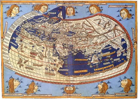
Ah, to be at the center the world! All cities, streams, harbors, mountains, gulfs, peninsulas, and continents radiating out from where you stand. From his seat in the great Egyptian library of Alexandria, the known world began to centralize around Ptolemy. It was here that the second-century Greek and Roman scholar was the first to take a measurement of the Earth, and fit the continents inside it, using the scientific method. In his seminal Geographica, he devised a grid—the beginnings of latitude and longitude, the Tropic of Cancer, and the Tropic of Capricorn—and proposed that any place might be found by plotting out its points by degree.
The Age of Discovery created a boom in information-gathering, Internet-like in its speed, each new map a wishful startup out to change the world.
But all maps are to some degree self-projection. A map might reflect its creator’s knowledge but it also imagined unknown worlds (see the The Lenox Globe, c. 1510. the only map which uses the actual phrase, “here be dragons”); it might record historical exploration but also make an argument for cultural supremacy. The Romans filled their maps with the places they knew, with little regard for the true shape of any continent (their Mediterranean stretched larger than any ocean). Christian mapmakers filled the edges of their known worlds with good and evil, monsters that crawled out of Africa; even the kingdom of Heaven was included on some maps. Around 1380, the narratives of Marco Polo began to shift interest east toward Asia and maps followed, though it was never clear how much of the traveller’s tale relied on fact. For the most part, maps were still documents that revealed more about their creator’s desires than the land they covered. Getting from here to there was another matter completely.
In 1481, Columbus sat down at his desk to write an impassioned argument for a very expensive endeavor. He knew that there was land that stretched far east, and that the circumference of the world must make it meet up again with the west. He also knew that no one finances a trip into the unknown, at least, not without some kind of guarantee. His argument would have to be persuasive, use calculations that were rational, a metric that was reliable, and come to a conclusion that was reachable. So he drew a map.
For Columbus, a map was an argument to gain patronage for a risky but rewarding journey, one that would appeal to his patrons’ wallets by capitalizing on their desire to expand their territory. First, Columbus took the calculations of Ptolemy, whose Earth was a strip of 180 degrees, and stretched out the already wide load of Eurasia to 225 degrees. To that he added the travels of Marco Polo (28 degrees) and the proposed distance from China to Japan (another 30 degrees). By stretching out the eastern coast of Asia like God’s finger to Adam, he concluded that his voyage from the Canary Islands to Japan would cover only 68 degrees of ocean, less than a third of the actual distance.
But unknown to Columbus, the discovery of the New World would carry at its heart a compound mistake in mathematics more than a thousand years in the making. His calculations had managed to shrink the earth to an uncanny proportion: 68 of his mangled degrees were the approximate distance across the Atlantic. When he landed in the West Indies, everything was, merely by accident, just about where it should have been. Columbus claimed until his death in 1506 that what he had reached was the east coast of Asia and not a new world.
The 1569 Mercator Map broke the mold in cartography by aiming to be more than just a pretty face.
For the first time, astronomy and mathematics were being used to wrestle the world into shape. But what kind of shape? Ptolemy’s map dominated European cartography for 1,400 years but it was limited in scope, showing the world through a narrow window of 180 degrees. Using Ptolemy’s map, Merchant sailors could do business from the Canary Islands to the eastern edge of Asia, north to Scandinavia and south to Saharan Africa, but they were limited to only exploring three-fourths of the actual Earth. Ptolemy’s map had other inaccuracies—for example, the sun still revolved around the Earth.
In the 50 years after Columbus’ expedition to the West Indies, map replaced map at a furious pace, each with new revelations about the size and shape of the continents. The Age of Discovery created a boom in information-gathering, Internet-like in its speed, each new map a wishful startup out to change the world: The 1507 Waldseemüller map used the popular, if aggrandizing, travel narrative of adventurer Amerigo Vespucci to christen a new continent. In 1513, Balboa stood on the edge of the Pacific and a far coast was added to that land. In 1522, the depleted voyage of Magellan limped home from the first trip around the world, its captain dead in the Philippines but its mission accomplished.
In 1512, around same time that Balboa was hacking his way through the jungles of Panama, Gerard Mercator was born in what would now be Belgium. Trained by a mathematician in geography and astronomy, Mercator grew up obsessed with maps and had a successful mapmaking business by the age of 24. The precocious cartographer published his first world map in 1538, a heart-shaped projection (part of the exhibit at the New York Public library) based on Ptolemy, but up-to-date in its depiction of North and South America as separate continents.
The 1569 Mercator Map broke the mold in cartography by aiming to be more than just a pretty face. It wasn’t made just to be looked at, it was a map that expected to be useful. In Ptolemy and Columbus’ equal-area projections the grid is equally spaced out across the board. In the Mercator projection, the latitudes and longitudes increase in size proportionally to the equator and to each other. Sailors could use the table to chart out their course, making the Mercator the first map that allowed travelers to track their process (rather than, like Columbus, simply aim at a distant point and hope you made it there). This new way of looking at and exploring the world was a huge success. In 1576, when Martin Frobisher found the entry to the Northwest Passage, a copy of the Mercator Map was tucked in his pocket.
Gerard Mercator himself traveled very little, never setting out to sea on the trajectories he so carefully plotted. When he was young, Mercator would spend a considerable amount of time away from his workshop, on surveying trips to the countryside. In 1544, he was arrested and brought in front of the Inquisition on charges of heresy, presumably for his preference of geography over the Gospels. Thanks to his friends he was released, and then moved to Duisburg, a walled city in western Germany. From there he produced maps of France, the Netherlands, the Balkans, and even Greece, and developed the most advanced globes of the age. And at the very center of this world was a man described as having “calm temperament and exceptional candor and sincerity,” engraving the changing borders of Brazil, Labrador, Siberia, and Japan, from his table in this small city on the Rhine. He never left it.
***
Despite its longevity, the Mercator is not for everyone. Sailors, engineers, and the military of Mercator’s own time found it useful for their ocean-bound explorations and campaigns, but scientists and geographers disliked what it did to the land masses far from the equator, which stretched out like two elephant ears on an otherwise handsome face.
As the Mercator map has aged, many countries who were pushed to the edges of the projection have found that this also affects how they are perceived by the rest of the world. Many countries have begun playing funhouse mirror, substituting different maps to see which one showed them to their best advantage. Chile, with its long north-south axis, was most in proportion on the Transverse Mercator, while North America appeared pleasant when viewed through the Lambert Conic Conformal. In 1963, a University of Wisconsin cartographer named Arthur H. Robinson introduced a radical correction to the maps used by the United States government since the turn of the century. The Robinson projection was a variation on the standard Mercator projection, squashing the north—Alaska, Greenland, the Northern Territories, and what was then the USSR—like the ragged edge of a pastry. The proportion was political: On the original projection the Soviet Union appeared 223 percent too large; Canada was oversized by 258 percent; the U.S. was a mere 64 percent larger than reality. The Cold War was on, something had to be done. In 1988, the National Geographic Society adopted the new Robinson projection, introducing a Soviet Union that was shrunk down to an 18 percent oversight. In less complicated but even more extreme political maneuver the Universal Press released their “Down Under Map” in the 1990s, which flipped the Mercator to show Australia at the top of the world.
“Mercator at 500” is at The New York Public Library through September 29, 2012
For more on the history of cartography, there are few books better than the 2001 revised edition of John Wilford Noble’s The Mapmakers, which traces the map from Ptolemy to the Mars Rover.